Today we will continue with another technical issue that can cause this kind of metaphorical blindness in the way we see photos. More specifically, today we will talk about shadows and highlights, and the way we set the camera to handle them. Essentially we're talking about the curve of the camera (that is, the given settings). A "vivid" setting will have a sharper curve, with deeper shadows and brighter highlights, while a "portrait" or "neutral" setting will have a flatter curve, with brighter shadows and darker highlights (compared to a "vivid" setting, that is).
 |
| Shadows and highlights, put simply, sometimes need to be blocked/blown |
The problem is, you can't just set "vivid" and take photos of colorful flowers or "portrait" for photos of people. These are only starting points; generic settings that, at least in some cases, are supposed to give you the desired result. But not all scenes are the same, and not all photographers are the same either.
To add to the complexity, there are all kinds of blogs, websites, - heck, I once even saw it in an official Nikon tweet - that tell you: "don't blow the highlights", "watch the highlights", "watch the histogram". Well, I'd once asked you not to be a histogram slave, telling you that:
Composition doesn't care about histograms; it doesn't care about shadows and highlights. As far as composition is concerned, the only thing that matters is balance and dynamics. Contrast (in terms of juxtaposition), patterns, relations, and virtual flows. If an element (whether it becomes blocked as shadows or blown as highlights) is either minor in the scene or, alternatively, it actually serves the composition by being blocked/blown [...]then this is what matters. Not a "perfect" histogram.
So, with that in mind, let's take a look at our case study.
The photo below is a typical example of what the straight out-of-the-camera jpeg of the Nikon D3200 looks like at the "standard" setting.
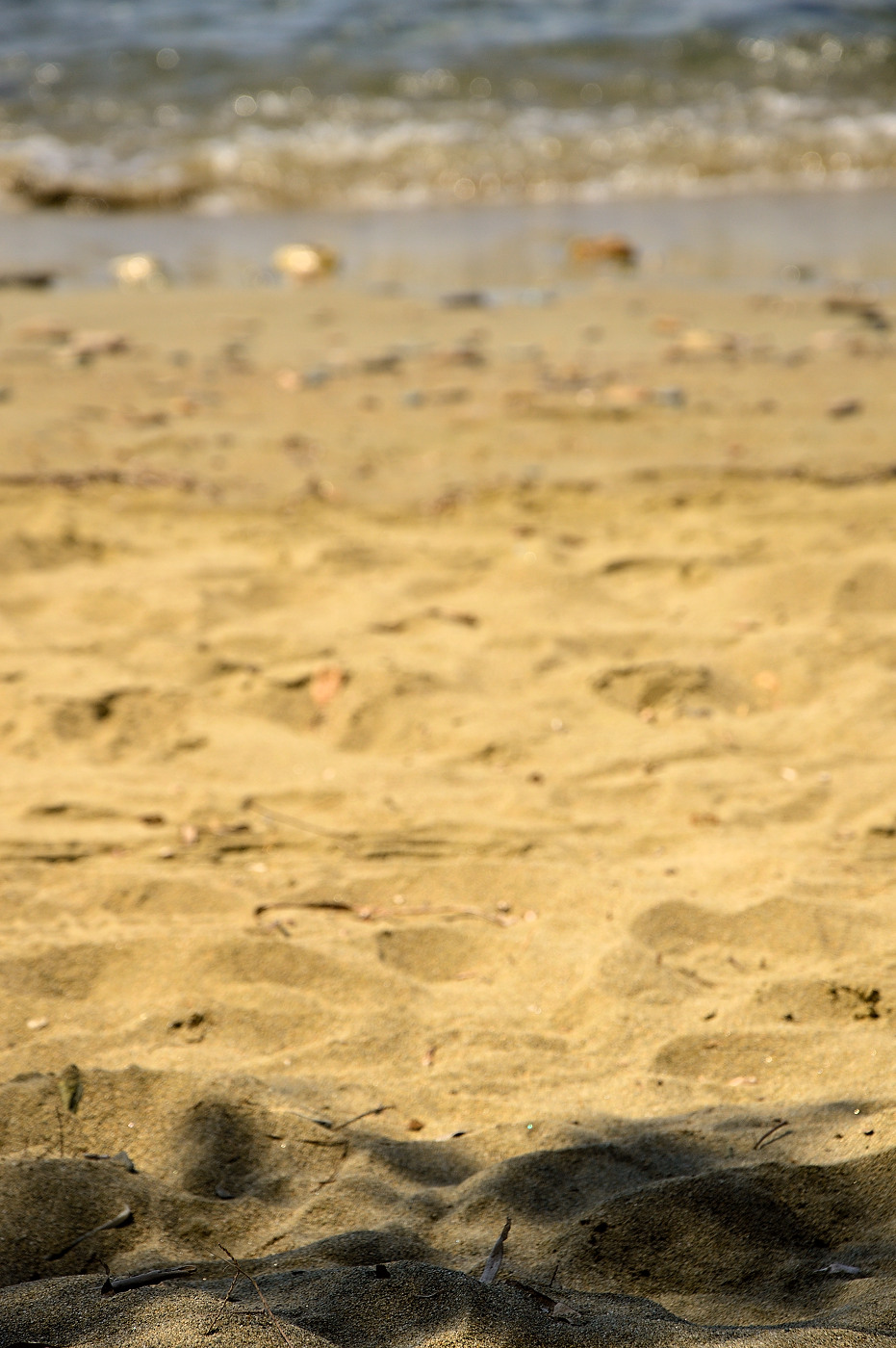
There's nothing really "wrong" with it in terms of shadows or highlights. And that's the problem. The image looks so balanced and what it's "supposed" to look, that it can cause blindness after repetitive use. It has happened to me too, though I think I've learned to recognized it more easily than white balance.
Here's the same image with a lower brightness setting.
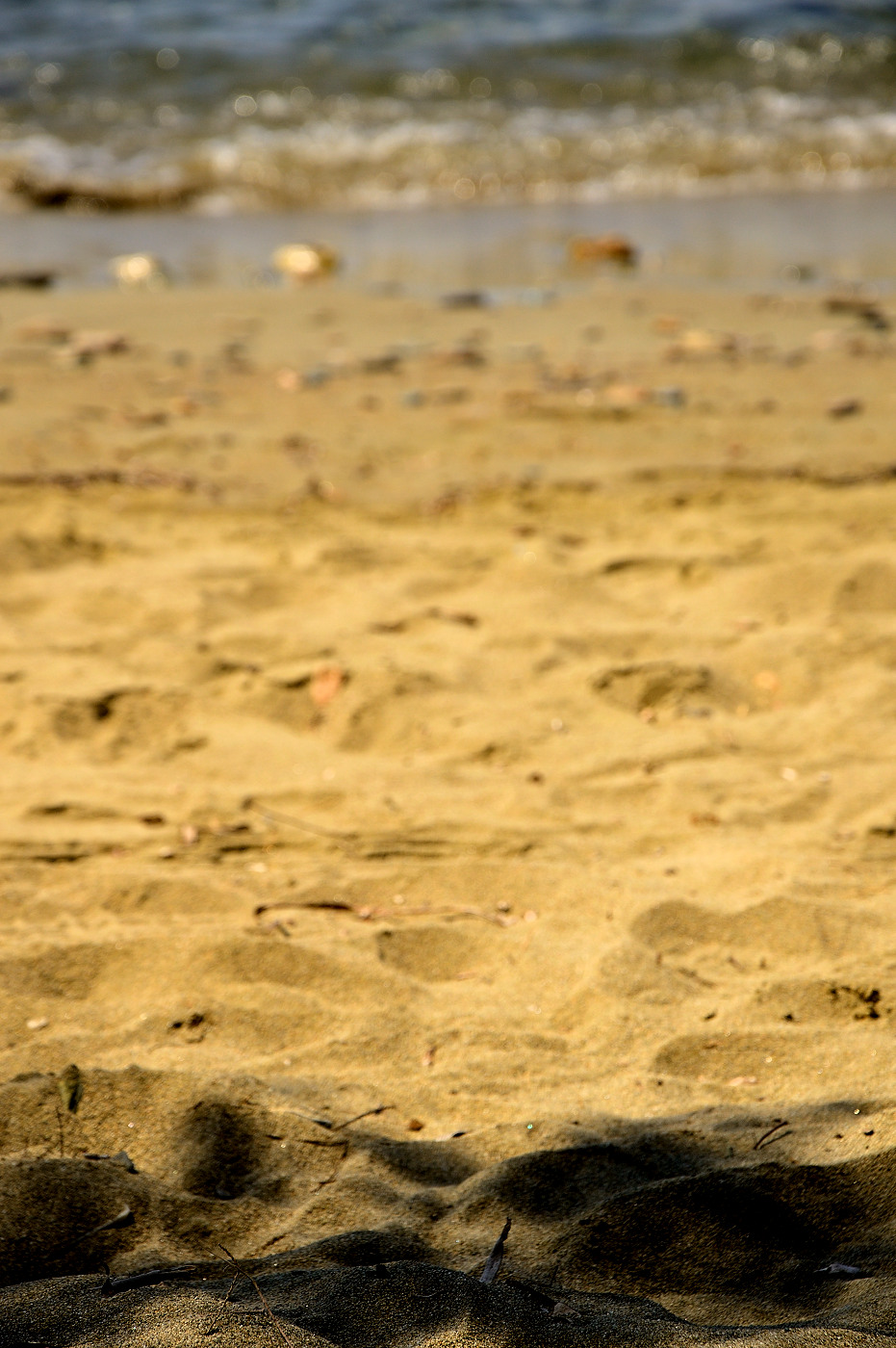
Nothing else has changed; I haven't increased contrast or saturation, I simply lowered brightness, effectively blocking the shadows. If you checked the histogram of this second image, the program would protest that you have blocked shadows, urging you to increase exposure and/or brightness. Ignore it. So what if you have blocked shadows? Notice how much more vivid (naturally so!) the sand looks, how deeper the color. Sharpness has probably improved too, due to the increase in the midtone contrast.
Let's see another example.
Here's the image straight out of the camera:
And here's the one with brightness reduced:

Not even close. The second image is much better in terms of conveying emotions and affect, although a significant number of people would be fooled seeing the first image, accepting it as "okay", and moving on.

No comments:
Post a Comment