 |
| Sharp enough for you? Today I'll teach you how to properly sharpen your images |
Things we'll cover in this article:
- Photoshop procedures for sharpening
- What to sharpen
- How much to sharpen
- What is micro-contrast and what's its role in sharpening
- Different media (screen, print, etc)
- Viewing distance ("uh-oh, it depends on that too?" Yep, I'm afraid so)
So, without further delay, let's begin!
As a very first thing I need to remind you what I said in that old article about sharpness: Sharpness and Sharpening are two very different things:
- In everyday terms we simply say "this lens is sharp" or "this lens is sharper than that one" to indicate this very thing: that, by virtue of its optical design, the lens in question can resolve a lot of detail (or more than another lens).
- Sharpening is the process that either the camera (through its sharpening settings) or the user (in post-production) increases the contrast between edges, in order to create what is, essentially, an increase in resolution perception.
Obviously enough, the sharpening process is limited by the resolving power of a lens. You can apply all the sharpening you want, if there isn't enough detail captured in the scene, it will take you nowhere.
Therefore, to make it absolutely clear, nobody can show you how to create a sharp photo if the captured image did not contain much resolved information anyway. But a proper sharpening procedure can really help an image that, although contains the original information, that does not appear on screen (or print)
Here's an example of what sharpening can do:
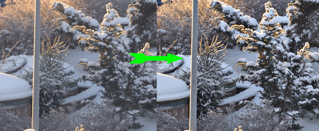 |
| Click to enlarge |
At this point, you might begin to realize that certain images look "better" (I'm not gonna try to define that) when they are sharp, vivid, and crisp, while others look "better" when they are not. I believe most people would agree that the snow-covered tree above looks better when it's sharper and more contrasty. On the other hand, a portrait photo, generally speaking calls for lower contrast and smoother transition (=less sharpness).
 |
| Portraits are, generally speaking, expected to be smooth, soft, without too much crispness |
The rule of thumb is this (and it's very generic, I know):
- when the image is intended for web/monitor display, work on it at the zoom factor it will be viewed. In other words, if the image will be a simple banner on your webpage, there is no point at all judging sharpness on a 24MP image at 100%.
- when the image is intended for print, work on it (and judge sharpness) according to the relevant media and viewing distance. In other words, use the zoom factor on your screen to emulate the approximate viewing distance. If we're talking about a 5x7" photo paper print, you'll need to set the image at 300dpi, the dimensions to 5x7, and work on that. Err on the side of oversharpening.
But what about procedure? Is there a magic Photoshop tutorial/method to give you the desired result? No, not really. There are more than one ways to the end result. It is true, however, that some procedures are more suitable for certain applications. I'll show you three Photoshop sharpening methods, each one for a different scenario.
1. When you want moderate sharpness everywhere (good for foliage, landscapes, textures)
i) Open your Image and duplicate the layer
ii) Apply an unsharp mask with low amount & radius and zero threshold.
iii) Repeat with the same values
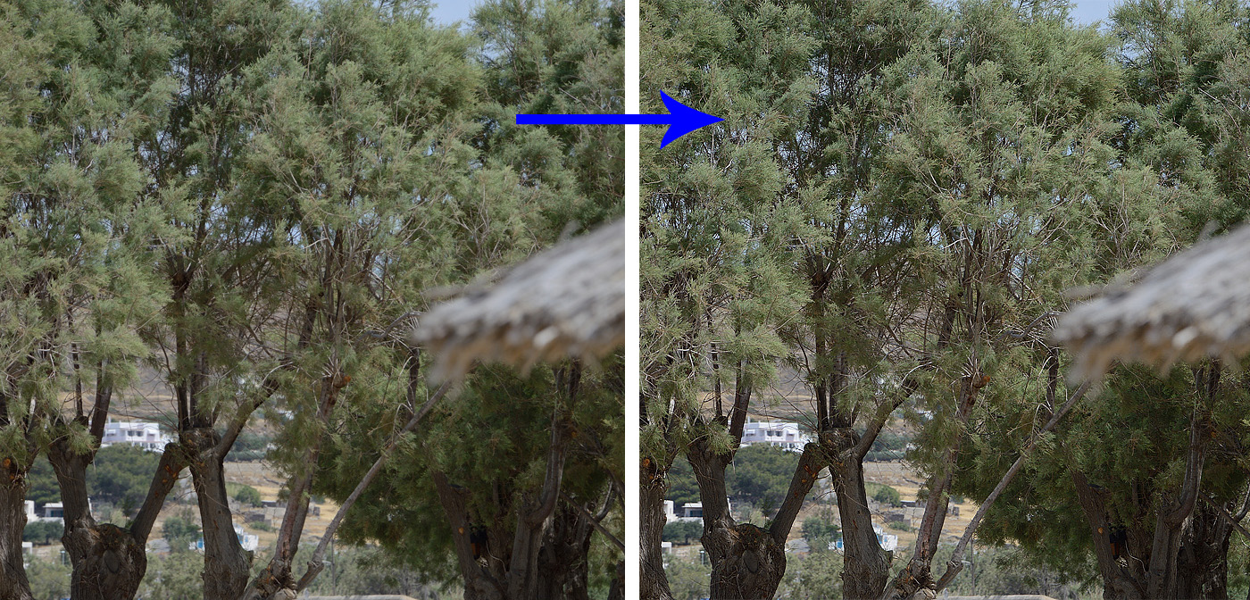 |
| Since we're judging sharpness, click to enlarge and view at 100%. I have sharpened expecting you to be viewing this image at your tablet/computer screen. If you are viewing it on a 50" TV or have printed it (!) as a photo, the dynamics are completely different and my sharpening is inaccurate. |
2. When you want strong sharpness in well-defined edges, and there are large areas you don't want to sharpen (good for landscapes with lots of sky present)
i) Open your Image and duplicate the layer
ii) Filter >Other > High Pass. Select the highest value possible without seeing halos and artifacts (for viewing small images intended for web/monitor, it's usually around 1.0
iii) Change the layer blending mode to Overlay.
iv) (Optional). You may want to run an unsharp mask procedure on the High Pass layer itself.
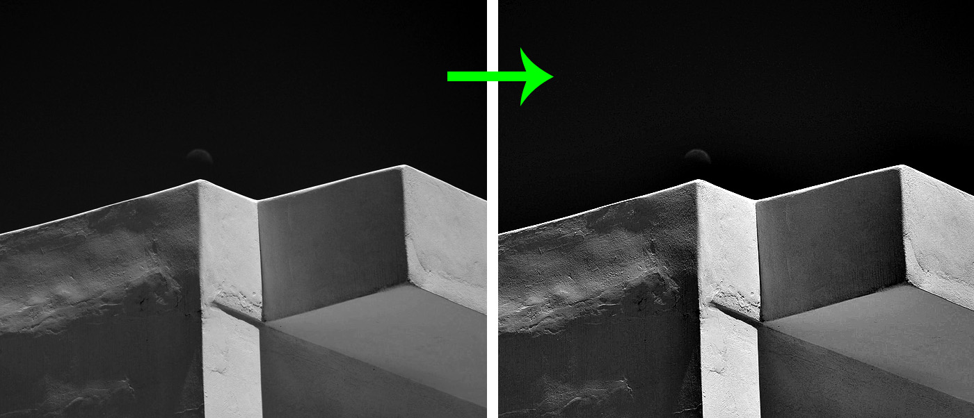
 |
| Again, click to enlarge and notice how the sky has remained unaltered while the foliage and details on the foreground have been sharpened |
3. When you want very aggressive sharpening on images that are already contrasty (I call this the Ansel Adams look)
i) Open your Image and duplicate the layer (I'll keep repeating this until people realize how important it is to work on a copy!)
ii) We'll do a midtone contrast boost: for the unsharp mask dialog, pick a very low amount and a high radius (for web/monitor, something like amount 20% and radius 50px).
iii) Now duplicate the layer again and we'll use the unsharp mask for sharpening. Pick values similar to those of case 1, further above. If you find it too aggressive, either reduce the opacity of the layer(s) or go back and try smaller values.
 |
| If you have a very contrasty image to begin with, particularly one with textures, consider this procedure. |

No comments:
Post a Comment