That wasn't an exaggeration. As the title of this article argues, exposure is about the only technical thing (i.e. leaving composition aside) that you need to understand and use well in order to create magnificent photos.
I can already hear objections flying at me. "What about color?!", you might shout. Color is indeed important in creating a mood, and so is tonality. But all of these are secondary compared to exposure, and the reason is...
*drumroll*
Exposure also controls color (and affects tonality).
The average Joe/Jill, when taking vacation photos, often complains that the colors are too dull, that there isn't enough "punch" in the photos, that they just look flat. They increase contrast and saturation (i.e. through camera settings, for instance, by selecting a "Vivid" setting), but that doesn't seem to solve the issue.
What's going on? Simple: Average Joe/Jill is unaware that s/he's facing an exposure problem
In order to make this as easy-to-understand as possible, let's use some photographic examples:
 |
| Try not to focus on how brighter the image on the left is, and examine its colors |
The photo on the left is overexposed. The photo on the right is underexposed. But try not to pay attention to the difference in luminance (i.e. how brighter the image on the left is compared to the one on the right). Rather, try to focus on the colors. The colors on the right appear as more saturated (and, indeed, they are if you measure the values on Photoshop) although no other adjustment has been made apart from exposure.
At this point, you might ask "but I want my photos brighter as well as more saturated, how do I get that?". First of all, you must understand something very important:
Exposure and Brightness/Contrast are two different things
To prove the point, here's how the image on the right looks if I adjust its brightness/contrast (using a curves layer):
 |
| This looks perfect. Properly bright and contrasty, with vivid (but not oversaturated) colors |
Now, things begin to look interesting, don't they? There is no way you can get this result from the overexposed image on the left. With digital cameras, a slight underexposure is really nothing to worry about. Overexpose (as most entry-level cameras do when left in 'Auto') and much color information might be lost. Here's another example:
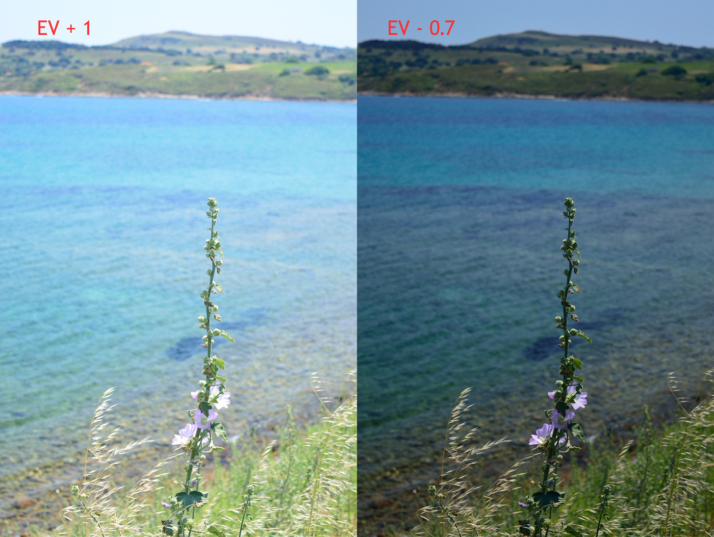
 |
| Here the camera meter was fooled so much that I had to dial in -1.0 exposure compensation |
Most people would get something like the image on the left (which, in fact, isn't even a worst-case scenario). But look how much better it can get if you pay attention to your exposure. Notice how properly rendered the flower petals are, with all detail preserved. In addition, notice the deep blue sky against the Parthenon - the details of which are lost on the image on the left.
In conclusion, you need to stop worrying about all kinds of meaningless (and largely arcane) technicalities. Your camera or lens don't matter, and the only technical aspect you really need to master (especially when we talk about photos such as these, i.e. landscape/travel photos) is exposure. Once you set the exposure (instead of allowing the camera to do it), then all other settings (contrast, saturation, etc.) will almost magically fall into place.
Do you like the following photo? Is it contrasty, with vivid colors? Wanna take a guess how much minus exposure compensation I had to dial in to get this result?


No comments:
Post a Comment