If you haven't done so, I recommend you take a look at the article on color vs black&white photography
So far, we have mostly referred to the possible symbolism of color, as much as to how saturated colors stand out more. A vibrant red will carry a much different weight than a dull grey. And there can be a multitude of connotations that can be drawn, based both on color symbolism (latent or explicit) but also on saturation difference.
But even on purely objective terms (to the extent we can talk about objective approaches to color perception), colors and, particularly, color matches, can have certain important implications. The human eye responds to certain color combinations in particular ways.
The most common of those, and the one most typically used for creative effect, is the complementary way of pairing colors.
RED and GREEN
ORANGE and LIGHT BLUE
YELLOW AND BLUE
PURPLE and LIGHT GREEN
Consider the following example:
 |
Does this mean we cannot use any other color combination? Of course not. Otherwise we would have only images with two predominant colors. Remember: Rules* in photography are to be broken. The complementary way of pairing colors does not tell us how to use colors in our compositions. It merely reminds us that certain color combinations carry certain implications.
* Technically speaking, this isn't even a rule; simply a factual reality about how the human eye sees the world
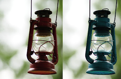
In very generic terms, maintaining complimentary colors enhances the "eye-candiness" of an image. It's what the eye "expects" to see, and what it's pleased by, generally speaking. This might or might not be compatible with the meaning you try to convey with your composition.
Consider this image:
The left (original) image shows non-complementary colors. The right (artificially changed) image shows the complementary red and green. As such, the red/green combination is somewhat more pleasing to the eye. And yet, there is something in the coldness of the left image that seems very appropriate for the composition in question (and the sense of solitude it implies).
As a conclusion, I must stress once again what I already said: There are no rules in photography; there are only conditionals. "IF this THEN this". Like with all other issues in composition, also color pairings come down to what you're trying to convey.


No comments:
Post a Comment