Many photographers have three or four versions of the same photo: a colored one, a black & white one, a sepia one, and maybe even a duotone one. Although this is fine for experimentation and learning, usually the choice for any of these should be a matter of composition, individual for each photo.
A (very) general rule of thumb is this: If there are contrasting colors in the scene, and we want to emphasize this contrast, color should remain. Consider the following image:
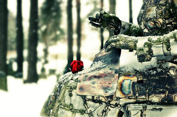
Here it becomes apparent that a black & white version of this image would offer substantially less contrast (speaking in terms of composition). The image works so well because of the juxtaposition of a lonely red flower with a green (indeed acidic and decayed) environment.
Sometimes there doesn't even have to be contrasting colors, because the drama of a scene originates from one single color:
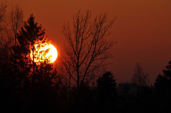 |
| Because we associate sunsets with particular colors, a black & white version of a sunset or sunrise would seem remarkably dull - if not outright weird. |
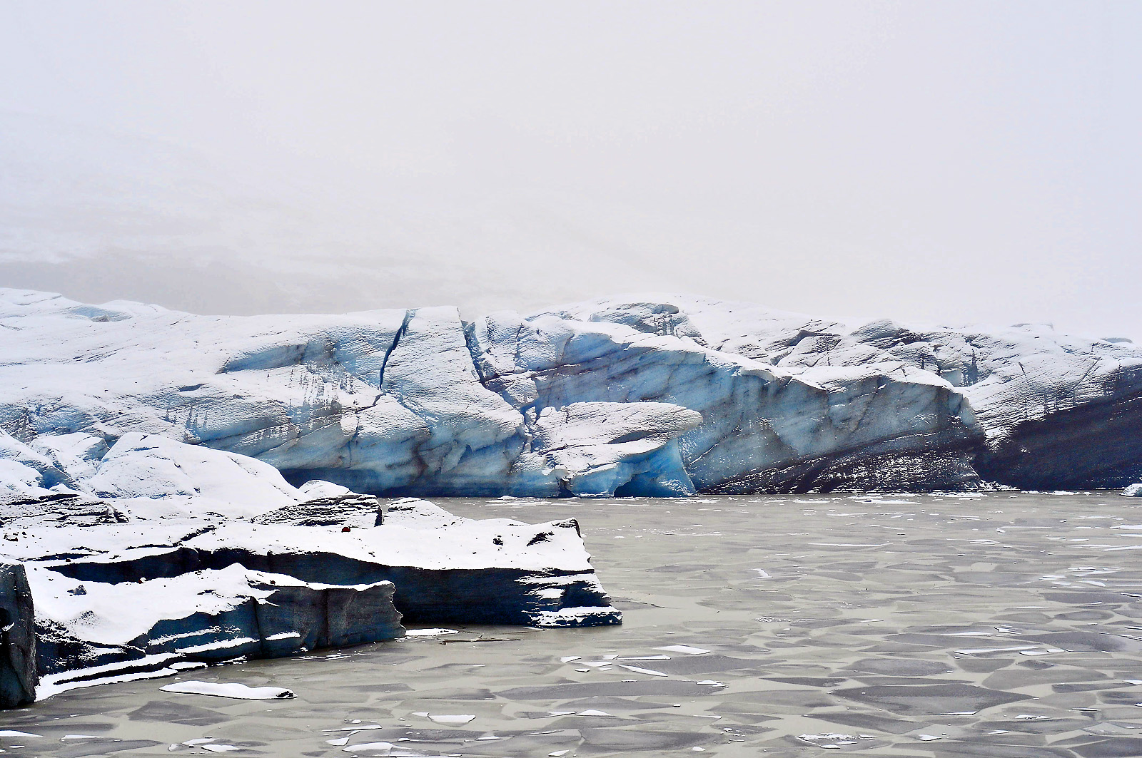
So, what kind of images are those which are good candidates for black & white photography? Again, as a general rule of thumb, these are the images which don't rely on colors (in fact, colors may be subdued or covering a very small percentage of the total area). The power of these images comes from textures and luminance contrast - meaning, plenty of variation between dark and bright areas. Consider this example:
 |
| There is very little color in this scene. But there is plenty of tonal variation. |
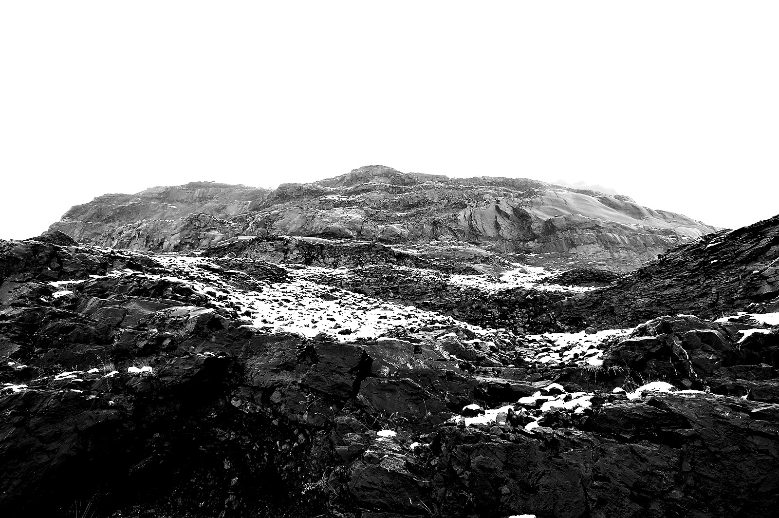 |
| A black and white image is highly appropriate for this photo |
Sometimes, however, what initially might seem as a black & white candidate, is in fact an image that can be very interesting in color! Consider the following pair of pictures:
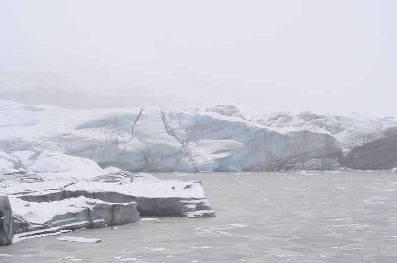 |
| This looks a bit like the image above, that is, very little color and plenty of tones. |
 |
| BUT! Some curves adjustment reveals a pretty vivid blue - certainly fitting in the scene of this glacier |
Finally, there are some images that could work both ways. In these, there is both a color and a texture/shape element, and the contrast in composition works on both levels:


Recognizing the potential for an image to become a good black and white photo is something that, like with all things, comes with experience. Especially since, as we saw, many photos can either work both ways or be exceptions to the rule.

No comments:
Post a Comment